Lifecycle
Understand how users start, return, remain, and churn over time
How Lifecycle charts work
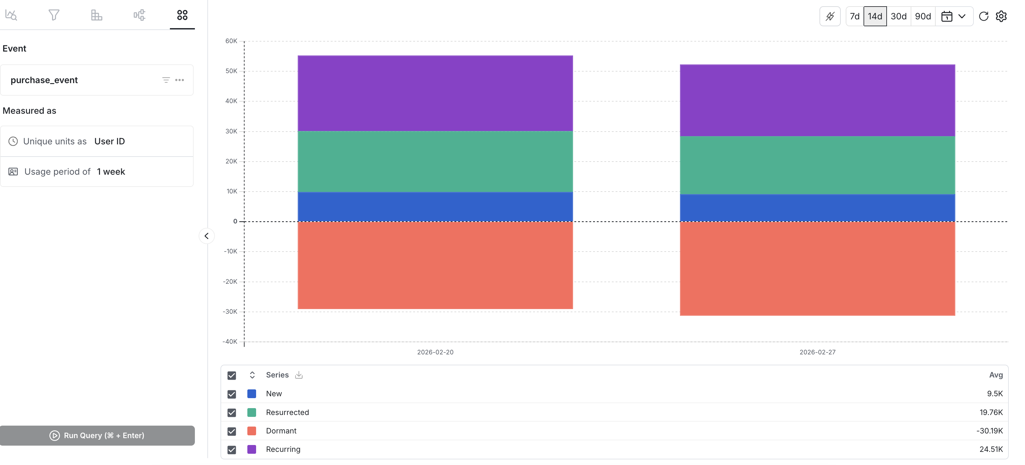
Lifecycle charts in Metrics Explorer help you understand how usage changes over time by classifying your unique units (for example user_id) within each time interval based on whether they used an event recently, returned after a gap, continued to use the event, or churned.
Use cases
- Track new-user ramp after a launch: See whether adoption is growing week over week after shipping a new feature.
- Monitor churn and reactivation: Understand whether users are falling off and whether they return.
- Compare retention health across releases: Spot changes in retention and reactivation patterns over time.
Creating a lifecycle chart
Step 1: Choose an event (or a compatible metric)
Decide whether to use a metric or an event. Lifecycle is designed for a single underlying event and count-style metrics composed of a single count-type event.
Step 2: Choose your unit (unique units)
Select what you want to count uniquely (for example user_id, stable_id, or another unit). The chart reports how many unique units fall into each category for each time interval.
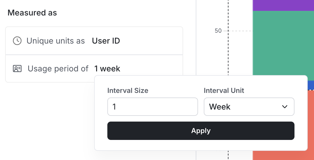
Step 3: Choose your interval (granularity)
Pick an interval unit (day / week / month) and a number of intervals per bucket (1–48). Each bar on the chart represents one interval bucket, and the chart shows one data point per bucket across the selected date range (max 1 year).
Step 4: (Optional) Add filters
Apply filters to focus on a specific segment (for example platform, country, app version, or a feature-related property).
Interpreting your lifecycle chart
Each interval bucket classifies unique units into four categories (mutually exclusive):
New: Used during this interval and didn't use at any point earlier within the lookback window (up to 1 year before this interval).
Resurrected: Used during this interval, didn't use in the immediately previous interval, and used earlier within the lookback window.
Recurring: Used during this interval and the immediately previous interval.
Dormant: Used in the immediately previous interval, but not during this interval (Statsig displays this below the axis to make churn visually apparent).
Reading the chart
X-axis: Time, grouped into your chosen interval buckets.
Y-axis: Count of unique units.
Stacked bars: Show how the composition of usage changes over time (new vs. resurrected vs. recurring), while the dormant component highlights drop-off between adjacent intervals.
Was this helpful?