User Journeys
Shows you the many paths users are taking through your product so you can better understand the end-user experience
How User Journeys works
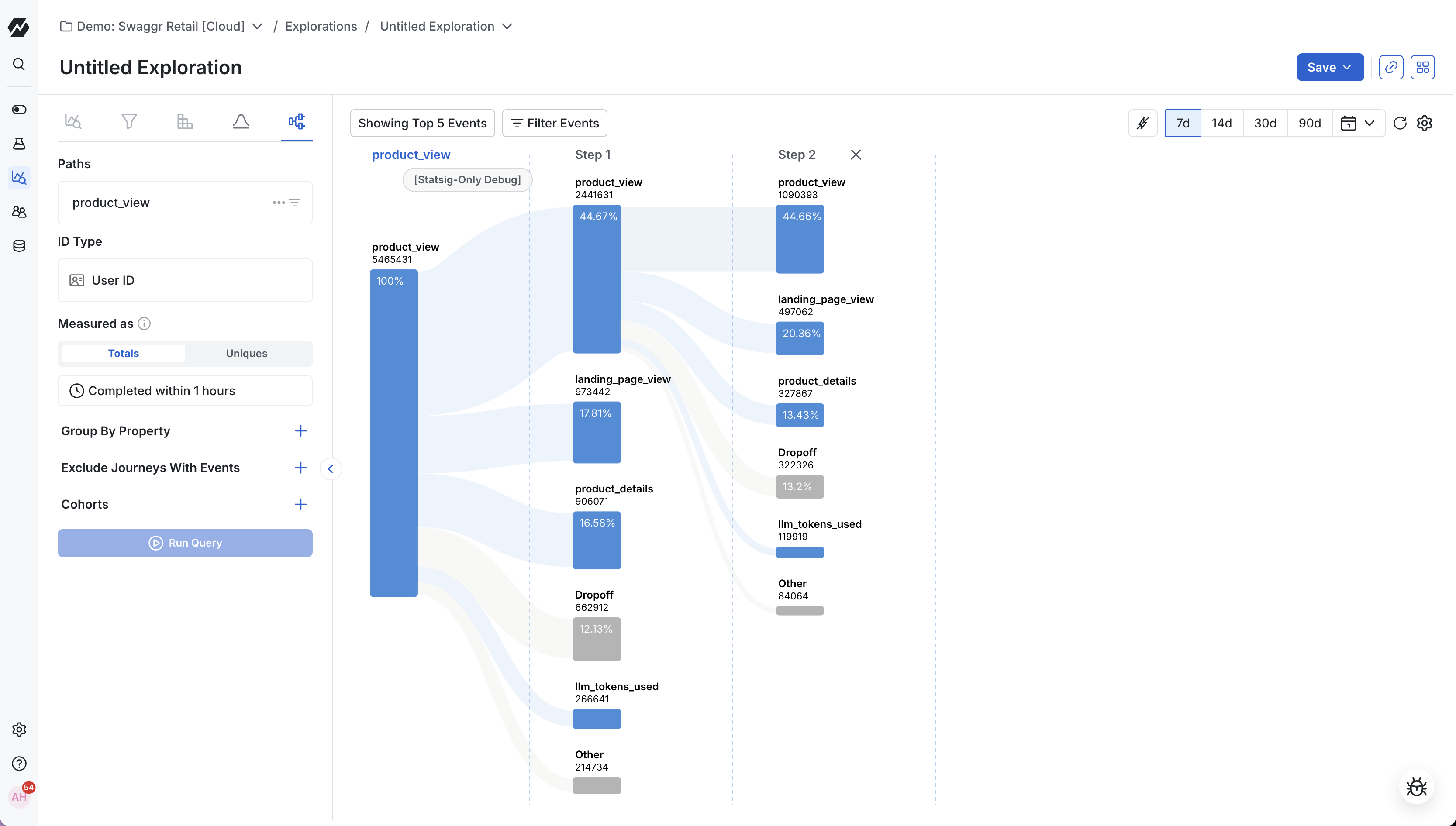
The User Journeys chart shows the many paths users are taking through your product so you can better understand the end-user experience.
Use cases
- Event pathways: Follow the most common paths users take through your product.
- Identifying drop-off points: Pinpoint where users drop off within key product flows.
- Discovering unexpected behavior: Uncover surprising usages and iterate on your product.
Creating a user journeys chart
Step 1: Choose a starting or ending event
Choose whether to explore a journey that starts or ends with a specific event. Starting events are often top-of-funnel events such as sign-up or log-in, but can also be an event trigger for any new feature you introduce into your product. Ending events let you understand where users came from before reaching a specific point.
You can optionally add filters to scope your analysis to a specific group.
Step 2: Choose an ID type
Statsig supports individual and group analytics. This lets you analyze the paths of registered users with User IDs, Stable IDs, or your own custom IDs.
Step 3: Define your measurement criteria
Under the "Measured as" section, choose between total conversions or unique conversions. Under total conversions, users can re-enter the flow each time they trigger the start event. Under unique conversions, each user appears in the path only once.
You can also specify the observation duration. The observation duration defaults to 1 hour, but you can change the length of time users have to convert to the next event. Adjusting this value helps validate whether users are passing through flows at the pace you expect.
To add more context, break the User Journey out by an event property. Select a specific event property to view the user journey expanded by its different property values (similar to a group-by). For example, you can view user journeys split by operating system.
You can also filter out user paths that include a specified event.
After editing the measurement criteria, click Run Query to apply your selections.
Step 4: Adjust your chart visualization
At the top bar of the chart, you can edit the conversion percent threshold, hide events, and expand your time window. The conversion percent threshold sets the minimum percentage of conversions needed to count as relevant. Statsig consolidates events below the threshold under "Others". The Hide Events selector lets you filter out events you don't want to see. The time selector lets you view user journeys during the time window you care about most.
Using User Journeys
After selecting your start event, a sankey diagram shows all the next steps users took. Click any node to display the next events users triggered. Each event shows the total number of events counted and the percentage of users who triggered it. Continue clicking nodes to explore user flows through your product.
Was this helpful?