Retention Chart
Help you understand how effectively your product or service maintains user interest and engagement over time
How Retention charts work
Retention charts in Metrics Explorer help you understand how effectively your product or service maintains user interest and engagement over time. Retention charts are useful for measuring product-market fit and are critical for overall product growth. By analyzing retention patterns, you can identify whether your product or certain features resonate with your audience, and which areas need improvement.
Use cases
- Long-term user engagement tracking: Monitor retention over days, weeks, or months to understand how long users stay engaged after their initial interaction or a specific trigger event.
- Stickiness of specific features: Identify which product features users return for.
- Sub-population analysis: Filter your retention analysis to specific groups to compare engagement across different user segments.
Creating a retention chart
You define a retention chart with a start event, a return event, and a return window. A retention chart lets you answer the question: "For users who performed the starting event, what percentage performed the return event within the given conversion window, over successive days or weeks?"
Step 1: Define a start event
The start event (or trigger event) indicates that a user has started using the product or service. Depending on the question you want to answer, the start event is often a top-of-funnel event such as sign-up or any active event. The start event can also be an event that represents use of the feature whose retention you want to understand.
To analyze the retention of a specific group of users, optionally add a filter to scope your analysis.
Step 2: Define a return event
The return event indicates that the user is getting value from your service. Depending on the question you want to answer, the return event can be returning to your product (another active event) or use of a specific feature.
You can also add a filter to the selected event based on user or event properties.
Step 3: Choose an ID type
Statsig supports individual and group analytics. This lets you analyze the retention of individual users or of whole groups such as organizations or companies.
Step 4: Choose a return time window
Choose whether to measure daily or weekly retention. When you don't expect users to engage daily to count as "active", a weekly return window is more useful. A weekly window answers: "For users who perform the start event, how many perform the return event within 1 week?"
Daily retention defines each cohort as users who performed the start event on a given calendar day. The chart then shows, over your selected time range (for example, 30 days), what percent of users in the cohort returned on each day.
Weekly retention defines each cohort as users who performed the start event within a calendar week. Each cohort spans successive weeks. The chart then shows, over your selected time range, what percent of users in the cohort returned during each week.
Step 5 (Optional): Choose a chart granularity for weekly retention charts
When you select weekly retention, you can optionally change the chart granularity by selecting "Daily" from the granularity dropdown in the top left of the chart.
Granularity is distinct from the Return Time Window. When you create a weekly retention chart with daily granularity, the chart shows, on a given day, what percent of the cohort performed the return event within the last week. For example, day 12 indicates what percent of the cohort performed the return event during the 7 days spanning day 6 through day 12, inclusive.
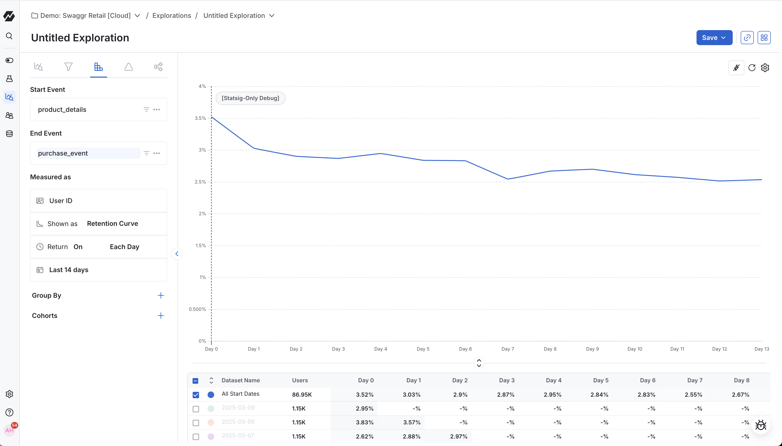
Understanding a retention chart
Retention charts in Statsig include two main sections: the retention graph (j-curve) and the retention table (triangle chart).Retention table (triangle chart)
A retention table, or triangle chart, shows how well you retain users after their first interaction with your product or service. The retention table tracks cohorts of users based on their first engagement date (defined by your start event). The table shows the percentage of those users returning (defined by your return event) over subsequent days or weeks.
The leftmost column identifies each cohort. Across the top are time intervals (days or weeks) after the initial engagement. Each cell shows the proportion of users from a cohort who were active at a specific time interval.
A vertical analysis (looking down a column) lets you compare retention rates of different cohorts at the same lifecycle stage. A horizontal analysis (reading across a row) shows how a single cohort's retention evolves over time. High numbers in the first few columns suggest strong initial engagement; consistent percentages over longer intervals indicate successful long-term retention.
Columns start at day/week 0, the earliest day/week in the time range. The rightmost column shows retention for the most recent day/week.
Column behavior depends on the selected granularity:
- Daily retention: Each column shows the percentage of the cohort that performed the return event on that calendar day.
- Weekly retention with weekly granularity: Each column shows the percentage that performed the return event within that week.
- Weekly retention with daily granularity: Each column shows the percentage that performed the return event on that calendar day or within the 6 days prior.
Retention graph
A retention graph plots the percentage of retained users against time. The X-axis represents time, segmented into daily or weekly intervals since the users' first interaction with the product. The Y-axis shows the percentage of the original users who remain active (performed the return event).
Reading the graph
The retention graph illustrates the rate at which users disengage over time.
- A declining curve followed by a flattening is common. This pattern indicates a drop in user interest after the first interaction, followed by stabilization among a core user group. The higher the percentage at which the curve flattens, the better the retention health of the product.
- A smiling curve shows an initial decline in retention followed by an upward trend at later stages. This pattern often results from successful re-engagement strategies or product improvements that bring back previously inactive users.
- A continuously declining curve indicates a consistent loss of users over time, often pointing to issues in user satisfaction or engagement.
Key aspects to observe:
- Initial Drop-off Rate: The steepness of the initial decline indicates how many users stop using the service after their first experience.
- Long-term Engagement: The slope in the later stages of the graph shows the long-term user engagement. A flatter slope at this stage means better user retention.
- Trends Over Time: Comparing multiple graphs over different time periods can reveal the impact of product changes or external factors on retention.
Scoping to specific cohorts
By default, Statsig plots only the "All cohorts" retention curve. To scope to a single cohort, click anywhere on that cohort's row in the table. To compare multiple cohorts, use the checkboxes on the leftmost portion of the table to select the cohorts whose retention curves you want to compare.
Was this helpful?