Metric Drilldown Charts
A versatile tool for understanding customer behavior and trends within your product
The Metric Drilldown chart in Metrics Explorer is a tool for understanding customer behavior and trends within your product. Use it to analyze key metrics and user behavior over time. You can also filter to specific properties or cohorts and use Group-By to compare behaviors between groups.
Use cases
- Trend Analysis Over Time: Track how specific metrics evolve over time. Visualizing product data in Metrics Explorer lets you compare key performance indicators and user behavior, and understand long-term trends and short-term fluctuations.
- Identify Cohorts: Define and explore cohorts by filtering to users who performed certain events at frequencies you define.
- Understand Feature and Experiment Impact: Split any metric by Experiment Group or Feature Gate Group to compare metric performance across groups. Use automatically generated chart annotations for feature launches and experiment starts to correlate decisions with changing trends.
- Segmentation and Comparison: Analyze how different user segments or product features perform to identify areas providing value or areas that need improvement.
- Filtering: Focus on specific segments or cohorts for more targeted analysis.
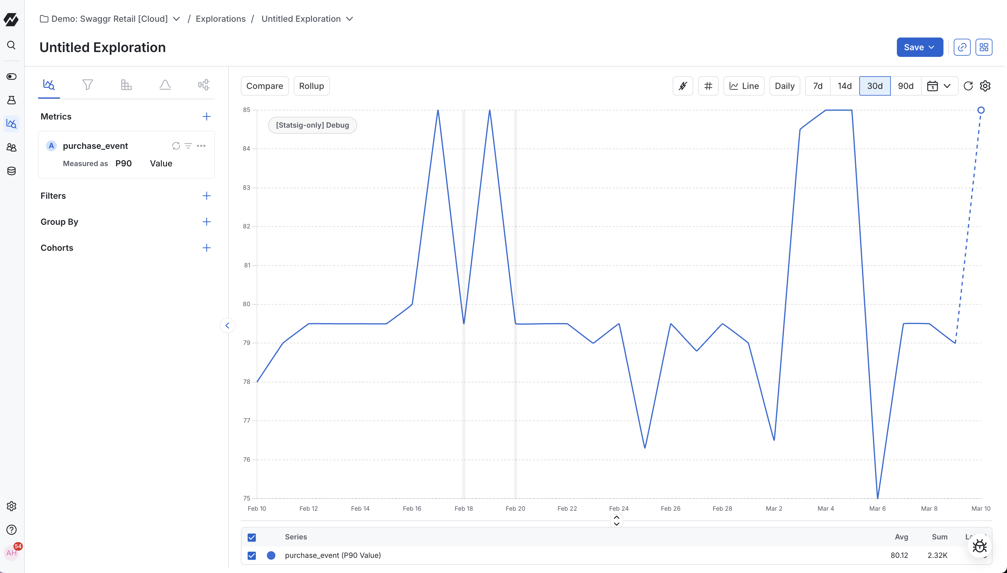
- Statistical Understanding: Understand how the average, median, or other percentile value (for example, p99, p95) of a metric changes over time.
- Dynamic Metric Creation with Formulas: Create new metrics dynamically using custom formulas to derive ad-hoc insights.
- Flexible Visualization Options: Choose from line charts, bar charts, horizontal bar charts, stacked bar charts, and other formats to best represent your data.
- Event Samples for Debugging: Access a metric's underlying sample events and the user-level information attached to each event. Useful for troubleshooting trends or anomalies.
- Detailed Data Control: Adjust data granularity from high-level overviews to detailed breakdowns. Use rolling averages to smooth data for trend analysis.
- Debug Experiments: Break down your experiment's first exposures to understand how properties or groups (feature gates, experiments, holdouts) affect the experiment.
- View Sample Ratio Mismatch (SRM): See the SRM of your experiments over time and drill down into event and user metadata to understand how properties (country, browser) or groups affect experiment SRM.
- Debug Feature Gates: Break down feature gate first exposures per rule to understand how properties or groups affect the gate.
- Analyze Dimensions Across Metrics: Identify top or bottom performers across multiple metrics by viewing data in a table and sorting by any metric-column combination.
Using the metric drilldown chart
Selecting metrics and events
In Metrics Explorer you can choose events, custom-metrics, auto-generated metrics, or experiment exposures to explore. You can add several metrics and events or exposures to plot on a single chart.
Events
When selecting an event, the chart plots the total number of times the event occurred (Count) for a given data point (hour, day, etc.) by default. You can also choose different aggregation methods:
Count: Plot the number of times the event occurred within the given time range per data point.
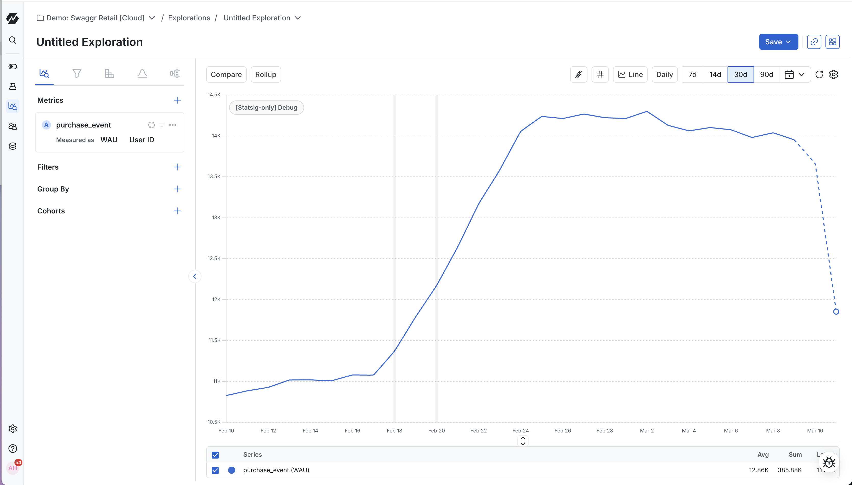
Unique: Plot the number of unique ids (generally UserIDs) that performed the event in the given time range per data point.
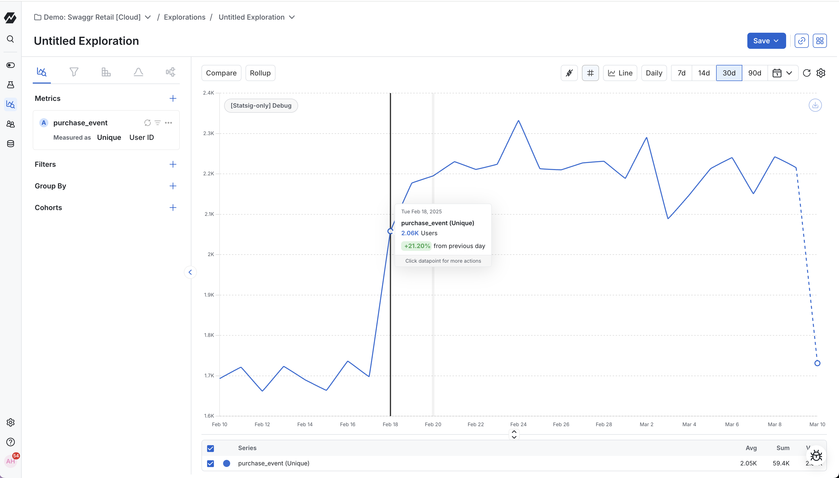
When viewing data on uniques (for example, unique users) at daily granularity, you can set the value of each daily data point to represent the number of unique weekly users (unique users over the previous 7 days). This shows how weekly usage is changing day over day.
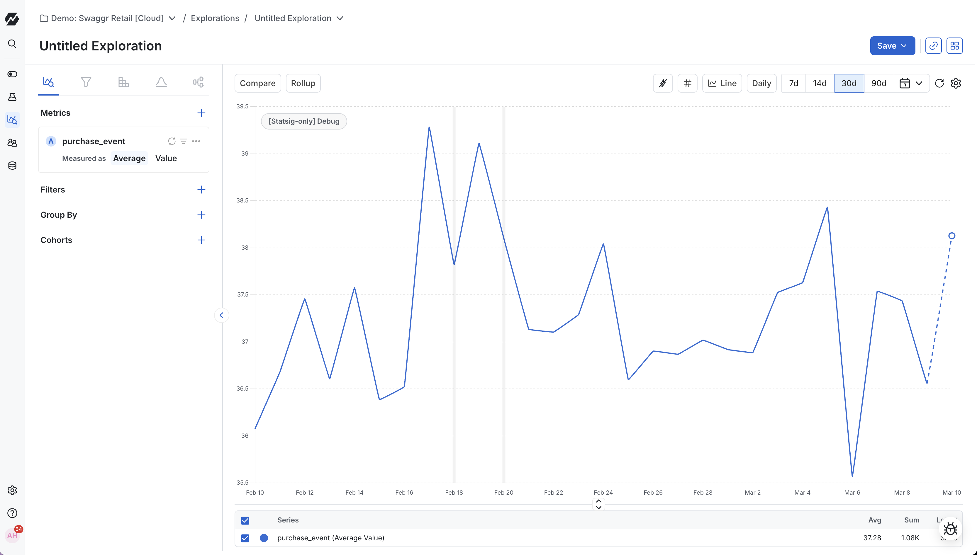
Average: Plot the average of a selected event property value per data point. This works only for properties with numerical values.
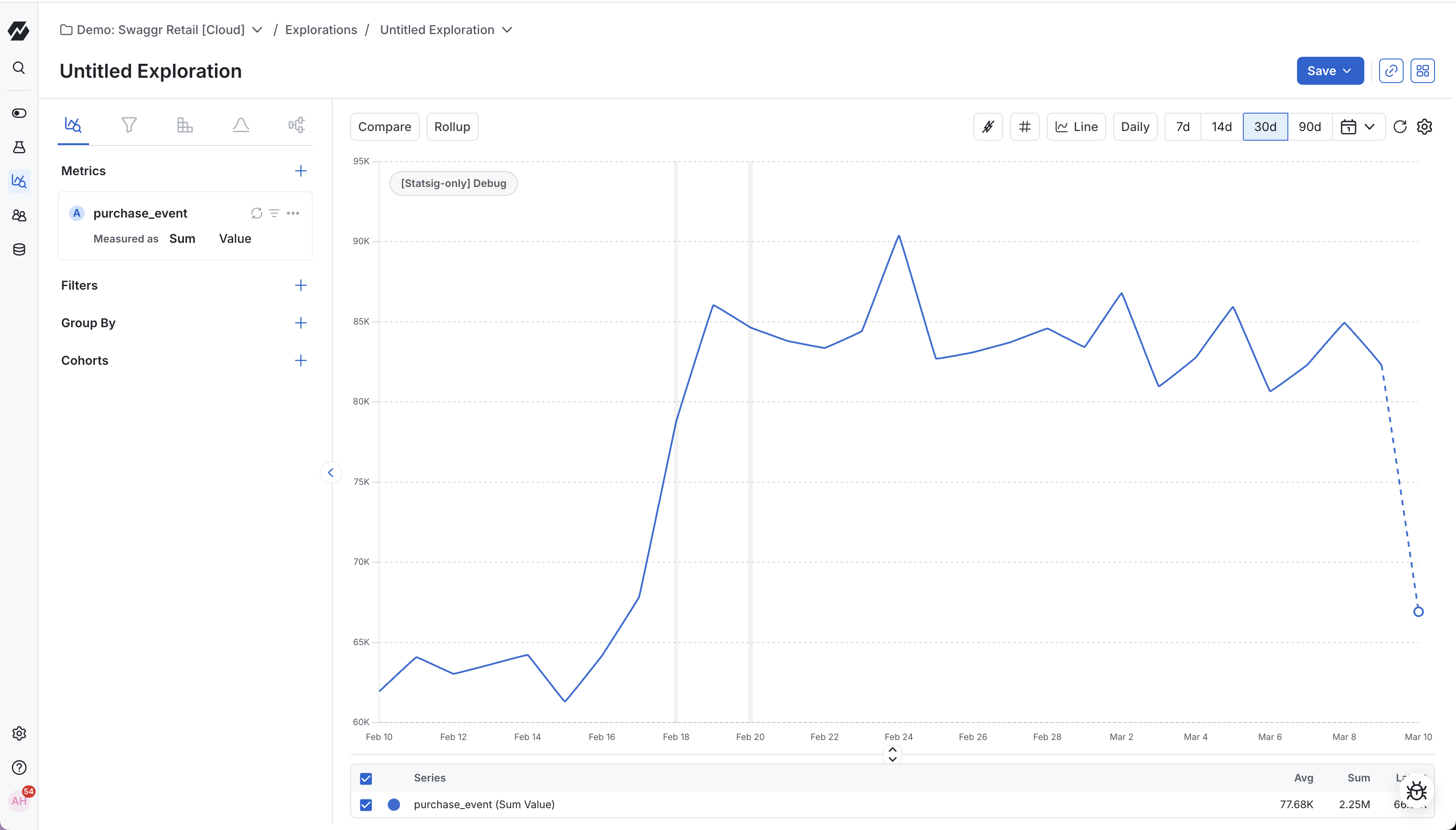
Sum: Plot the sum of a selected event property value per data point. This works only for properties with numerical values.
Percentiles: Plot the value of a selected event property at the selected percentile per data point.
Unique Values: Plot the count of distinct values for any property across events or users within the given time range per data point. This aggregation helps answer questions like "How many different referrers drove traffic last week?" or "How many SKUs were added to carts today?" by counting unique property values rather than event occurrences.
Count per User: Plot the frequency distribution of how often users perform a specific event. The chart shows statistics like average, median, or percentile values per user within the given time range per data point. This aggregation helps analyze user engagement patterns by measuring how many times each user performed an event, then applying summary statistics across those users.
Exposures
When you select an experiment or gate exposure, the chart plots its first exposures over your selected date range. First exposures are the first time Statsig exposed a unique id (set on the experiment or gate) to each of your experiment groups or each of your gate's rules.
Understanding first exposures in feature gates
When you check a gate for a user, Statsig creates an exposure for the rule whose conditions the user met. If Statsig exposes a user to multiple rules at different times, it keeps the first exposure from each rule. Group by rule to see each rule's exposures separately.
Metrics
Selecting a custom Metric or auto-generated Metric plots the value of that metric over your selected date-range.
Viewing and modifying the metric definition
The metric definition appears directly below the metric name. You can also make ad-hoc edits to the event-based definition to plot new metrics dynamically, based on existing metric definitions.
Comparing multiple metrics, events, or exposures
You can compare multiple metrics or events by plotting them on the same chart. To add a metric, click the + icon and select Metric, then select the metric.
When you plot multiple metrics, click any metric's row in the table below the chart to scope to that metric. Click the row again to show all metrics.
Use the checkboxes next to metric names in the table to scope to a custom set of metrics.
Filtering
Filters let you scope to events and metrics logged by users with specific properties.
To add a filter to an event or metric, click the filter icon and select the event or user property to filter by.
Adding formulas
Formulas let you dynamically combine and transform plotted events and metrics using mathematical expressions to answer new questions.
To add a formula, hover over the + icon in the Metrics section and select Formula. A free-form text field appears. Use the label of each plotted metric or event as a variable (each plotted metric is labeled with a letter). For example, if you have:
- Metric A: number of unique purchasers
- Metric B: total purchases
You can plot purchases per purchaser as B/A.
Drilling down
In addition to plotting metrics, you can drill into your metrics to identify unique groups that reveal how people use your product.
Group-By
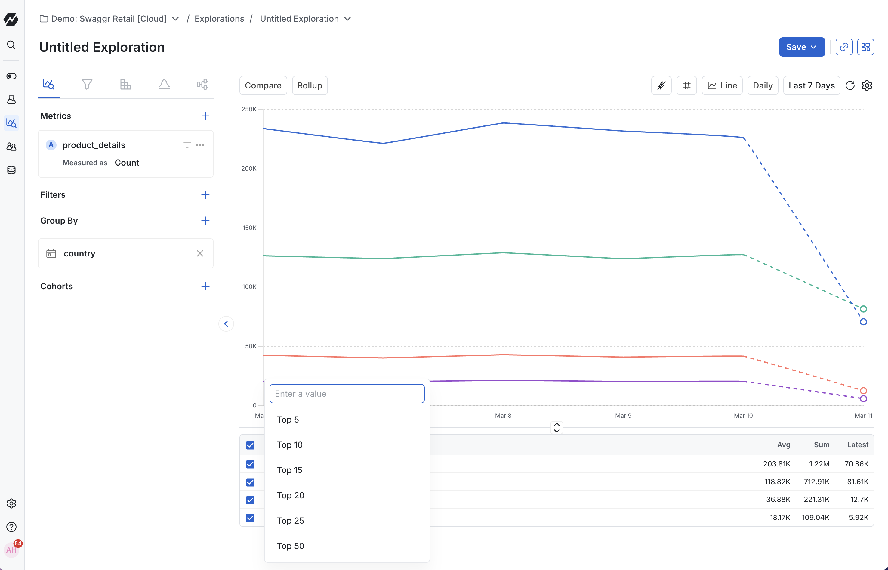
A Group-By disaggregates plotted metrics and events by a selected property or group, letting you compare how an action or user behavior correlates with a specific property. Adding a Group-By splits the plotted metrics into separate plots. By default, the chart shows the top ten groups by value. You can select up to 50 groups when you set the chart to daily granularity.
You can group a metric by event properties, user profile properties, experiment group, or feature gate group.
To adjust Group-By limits, add a group-by, go to the summary table below the charts, and click the Top X series dropdown. Select how many groups to display (up to 50). This feature is available for line charts, stacked-line charts, bar charts, and stacked-bar charts.
When you have a Group-By applied, you can view the results as raw numbers, or as a percentage.
Feature gate and experiment groups
You can also select a Feature Gate or Experiment to split a metric by the different groups in the selected test.
Adding a group-by
To add a group-by, hover over the + icon in the Drilldown section and select Group By. Then select the property or experiment group to split the metric by.
Quickly hiding or isolating lines
When using Group By, you can isolate lines to show data for specific groups. Click the row representing a group in the table view below the chart. Clicking an already-isolated group shows all groups again.
Use the checkboxes in the table view to scope to a custom set of groups.
Define and compare event-based cohorts
Building a useful group of users to analyze often requires more precision than comparing by property values. For example, you may want to understand the behavior of power users and compare them against your general user base.
To support this, you can define event-based cohorts. Select an event of interest, then define a frequency criterion for how often users in the cohort performed the event:
- Performed the event at least some number of times
- Performed the event at most some number of times
- Performed the event exactly some number of times
You can also define the time window in which a user performed the event, and filter to a specific property for more granular cohort definitions.
You can save cohorts to reuse them later.
Exploring a metric drilldown chart
Selecting chart granularity
The Metric Drilldown chart supports daily, hourly, 30-minute, 5-minute, and 1-minute granularity. The granularity setting controls the interval between x-axis values. Granularities below hourly limit the analysis time window to 1 day.
The default granularity is daily. To change it, select the Daily dropdown in the top right of the chart.
When viewing data on uniques (for example, unique users) at daily granularity, you can set each daily data point to represent the number of unique weekly users (unique users over the previous 7 days). This shows how weekly usage is changing day over day.
Setting the date range
The default date range is 14 days. To change it, click the Last 14 days dropdown and select a quick date range or a custom range.
Changing your unit type
The default unit type is numbers. To view data as a percentage, time value, or measurement of space (bytes, bits, etc.), click the settings cog in the top right corner of the chart and select a format unit type.
Smoothing out the data with rollups
Metrics like daily usage often have seasonality effects that make longer-term trends harder to see. Rollups such as a 7-day rolling average help smooth this data.
Statsig supports the following rollups to smooth out data, each of which you can roll up over 3, 7, 14, 28, 48, or 60 data points:
- Rolling average: Replaces each data point with the average of the preceding selected number of data points.
- Rolling sum: Replaces each data point with the sum of the preceding selected number of data points.
- Cumulative Sum: Replaces each data point with the sum of all preceding data points, including itself. The result is a continuously increasing total where each value represents the accumulated sum.
Selecting the chart visualization
Metrics Drilldown offers many ways to visualize your data, including:
- Line: Useful when plotting one or more metrics over time.
- Stacked Line: Useful when comparing groups to understand the relative proportion a certain group has of a metric or event.
- Bar: Useful when comparing the total value of two metrics over the entire date range.
- Horizontal Bar: Ideal for grouped data comparisons, especially when you have longer label names. Makes it easy to identify top and bottom performers across any business dimension like user types, locations, or platforms.
- Donut: Useful for visualizing the proportional breakdown of a whole into distinct categories at a single point in time. Perfect for showing how different segments (like countries, user types, or feature groups) contribute to your total metric value. Apply a Group-By to any metric to see the breakdown as a donut chart.
- World Map: Visualize your metrics geographically by country when using a country-based Group-By. This view makes it easy to spot geographic trends and understand how your product performs across different regions.
- Single Value: Display key metrics at a glance for quick summaries. Perfect when you need to highlight a single important number or KPI without the complexity of a full chart.
- Data Table: Compare multiple metrics across groups in a structured table format. Ideal for detailed analysis when you need to examine exact values and perform side-by-side comparisons of different segments.
Both donut charts and world maps work with any metric when you apply a Group-By. Select your metric, add a Group-By for the property you want to analyze (such as country for geographic analysis), and choose your preferred visualization from the chart type selector.
Zooming in
To zoom in on a portion of the date range, click at one end of the range, hold the mouse button down, and drag to the other end. Release the mouse button to zoom in. To reset the zoom, click Reset Zoom in the top right of the chart.
Sharing your insights
When you want to share an insight, you have several options:
- Share by URL: Copy the URL. This shares the query as currently defined.
- Create a share link: Click the … button in the top right of the chart and select Share Link. This copies a shortened URL to the clipboard.
- Share to Dashboard: Click the … button and select Export to Dashboard to save the chart to an existing dashboard or create a new one.
Sharing a chart through a URL or shortened link captures a snapshot of the chart as defined when you copied the link. The share link doesn't capture subsequent changes.
Was this helpful?