Distribution
Visualize the range of user experiences across your product
How distribution charts work
Distribution charts in Metric Explorer help you visualize the range of user experiences across your product. These charts are useful for understanding central tendencies, evaluating product health, and identifying outlying behavior.
Use cases
- Analyze the spectrum of experiences: Study the distribution of event values to identify any trends.
- Measure feature engagement: Visualize how often each user is interacting with a critical event.
- Monitor product performance: Ensure that your product isn't experiencing performance issues like unusual latency times.
Creating a distribution chart
Step 1: Choose a metric or event
First, decide whether to use a metric or an event. The distribution of a metric shows the aggregated property value per unit ID. For example, if the metric aggregation is by count, the chart displays the number of times each user triggered the event. The distribution of an event shows the range of data stored under the Value property for each logged event. Statsig displays the event distribution only when the data under Value is numeric.
Step 2: Refine your bucket size
By default, the bucket size is 1, with a minimum value of 0 and a maximum value of 10. Buckets are always lower-inclusive and upper-exclusive. If the range exceeds the maximum bucket value, the chart shows the data as "10+". You can adjust bucket sizes, minimums, and maximums to find the best view of your data.
Interpreting your distribution chart
Distribution of a metric
For the distribution of a metric, the chart always represents metric values per unit ID. The X-axis represents the metric value, which can be a count of events or the sum or average of a property value, depending on the metric configuration. The Y-axis represents the unit ID, which can be users, stable IDs, or a custom ID.
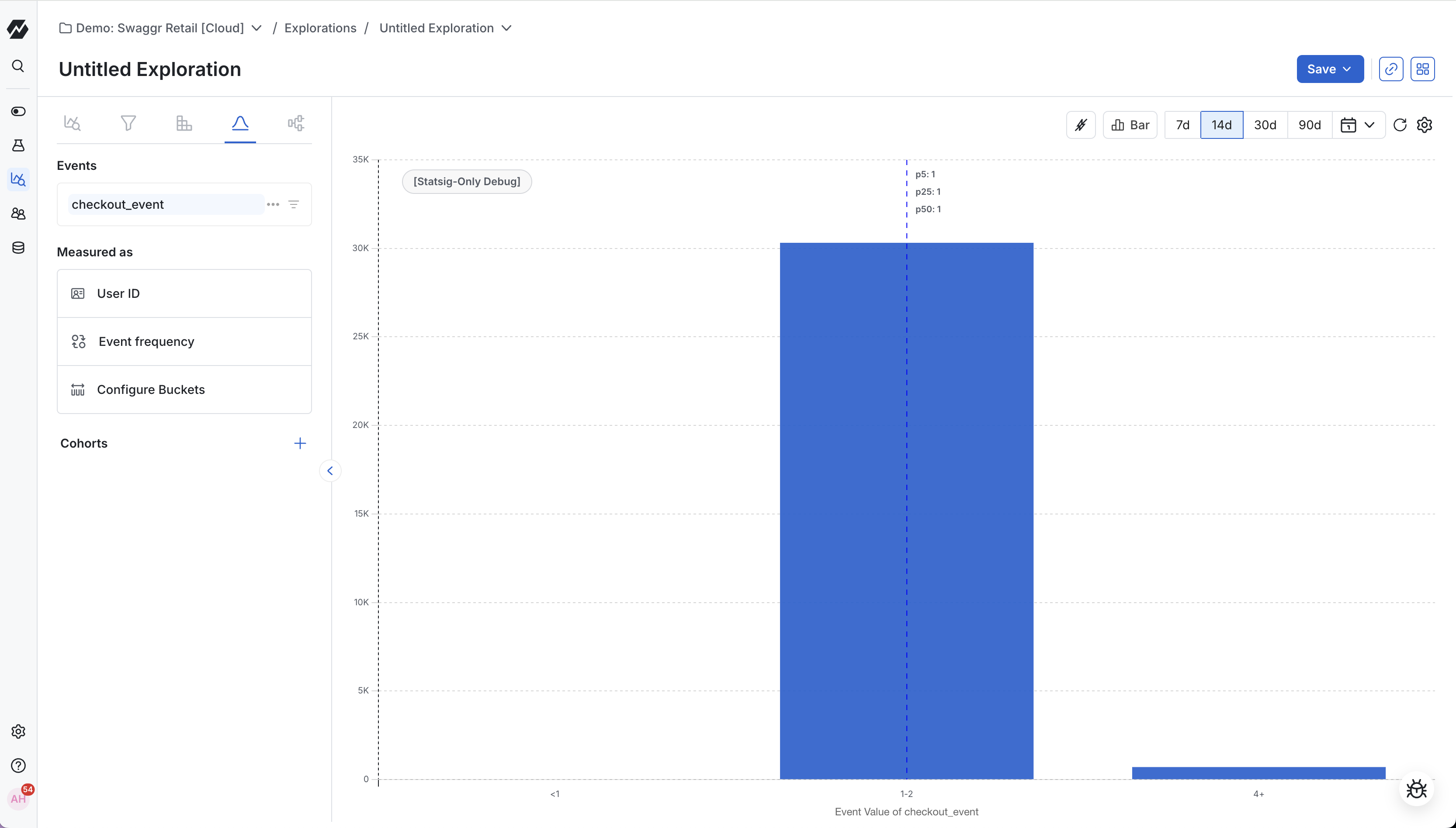
Distribution of an event
The distribution of an event always displays the range of data under the Value property. The X-axis shows the Value and the Y-axis shows the number of events.
Was this helpful?